3 min read
Multi-Way
Prototyping
E-Commerce Website
UI Design
ROLE:
Research & Design
TIMELINE:
Jan - Apr 2024 (15 weeks)
TOOLS:
Figma & Microsoft Teams
APPROACH:
Goal-Directed Design
THE PROBLEM
The current transportation infrastructure in America is lacking.
America's transportation infrastructure is lacking due to overreliance on cars. This dependence not only affects our daily lives and health but also influences our society and city planning. Diversifying transportation modes is crucial for numerous reasons: traffic, accessibility, cost, and pollution (emissions & noise).
THE PRODUCT
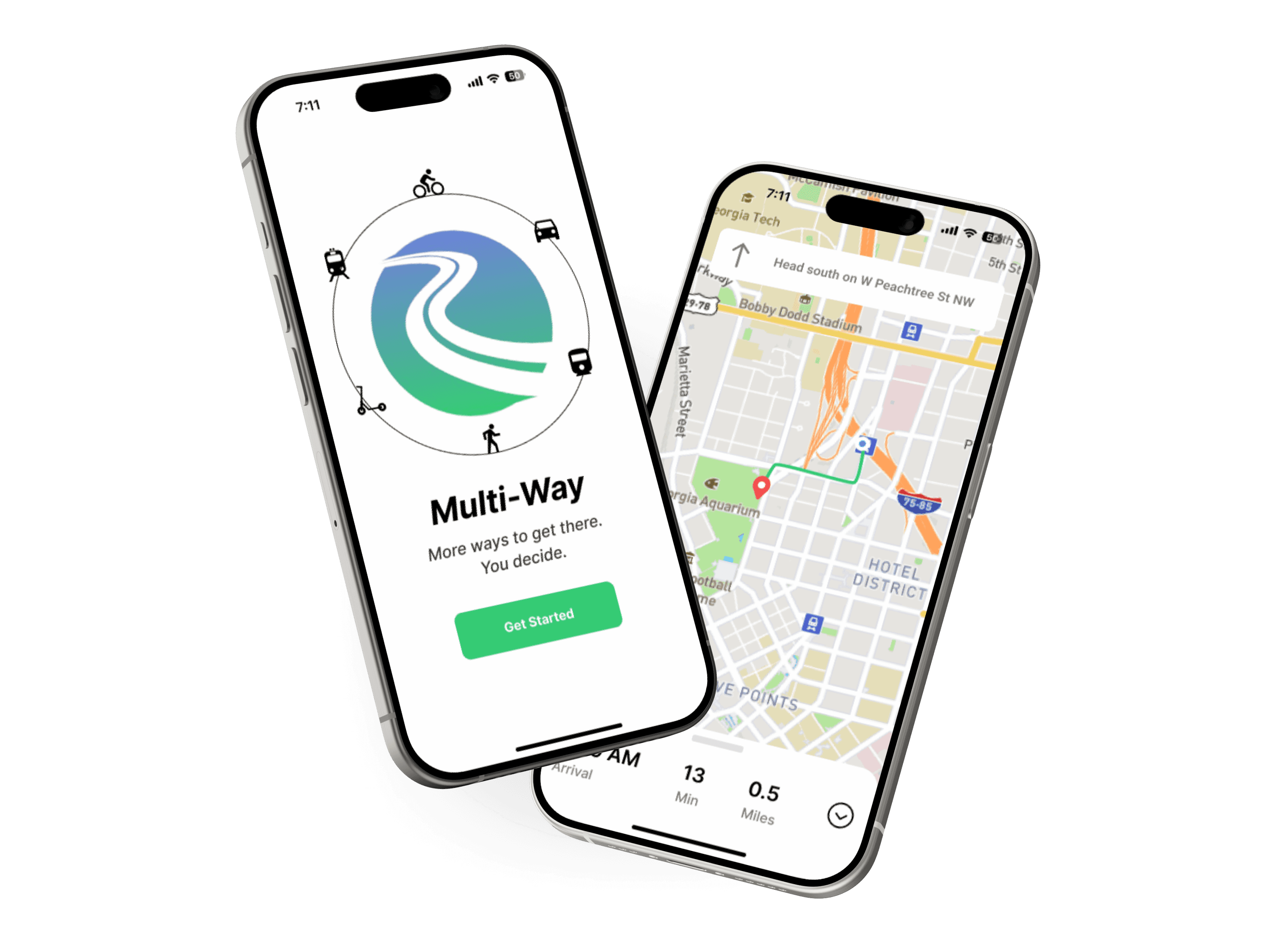
Multi-way is a navigation app that allows you to select multiple forms of transportation in a single trip, encouraging users to find a better way to travel.
View Prototype
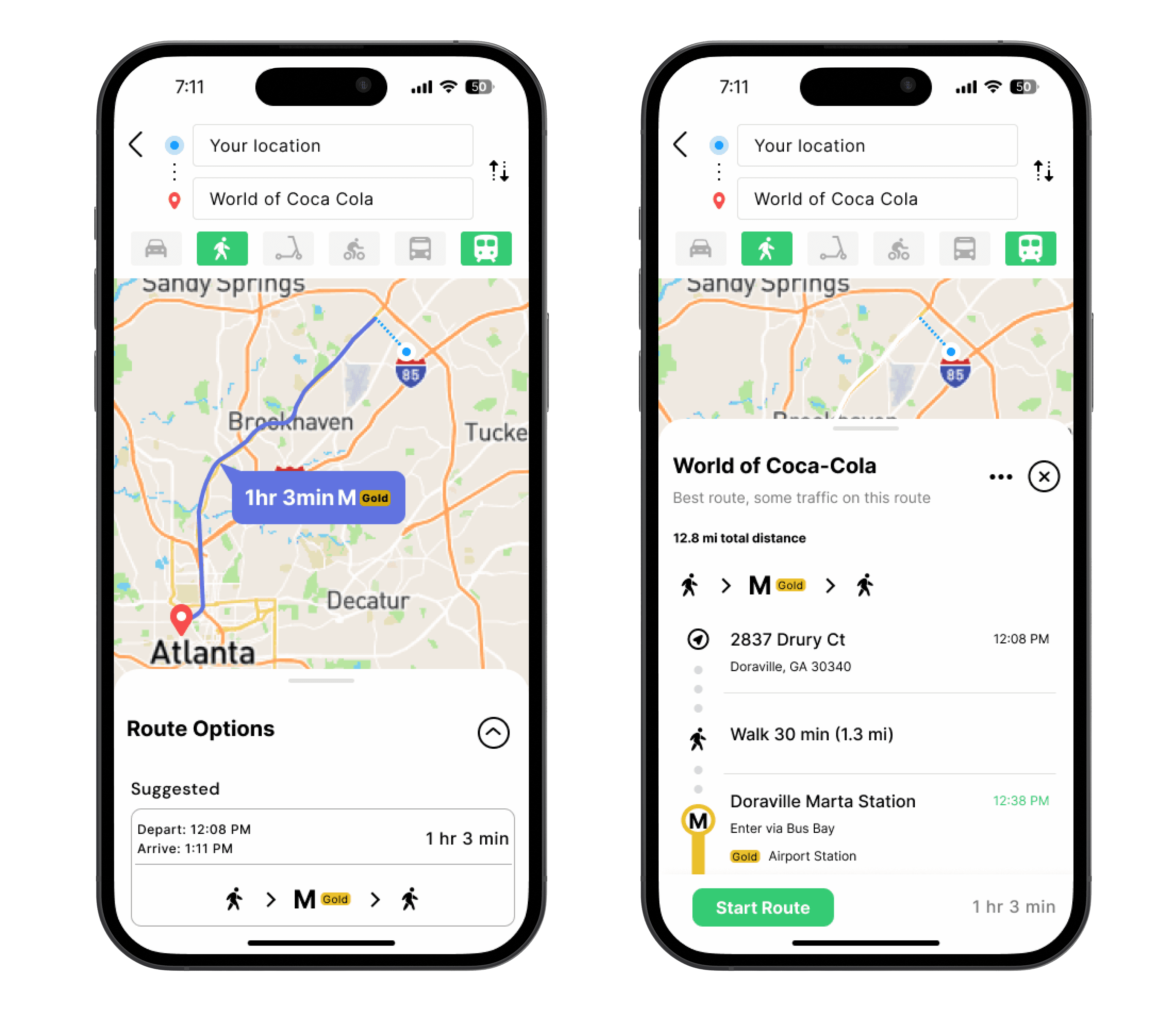
Select Multiple Forms of Transport
Urban areas are hard to navigate, streamline your navigation experience by selecting all the ways you'd like to travel.
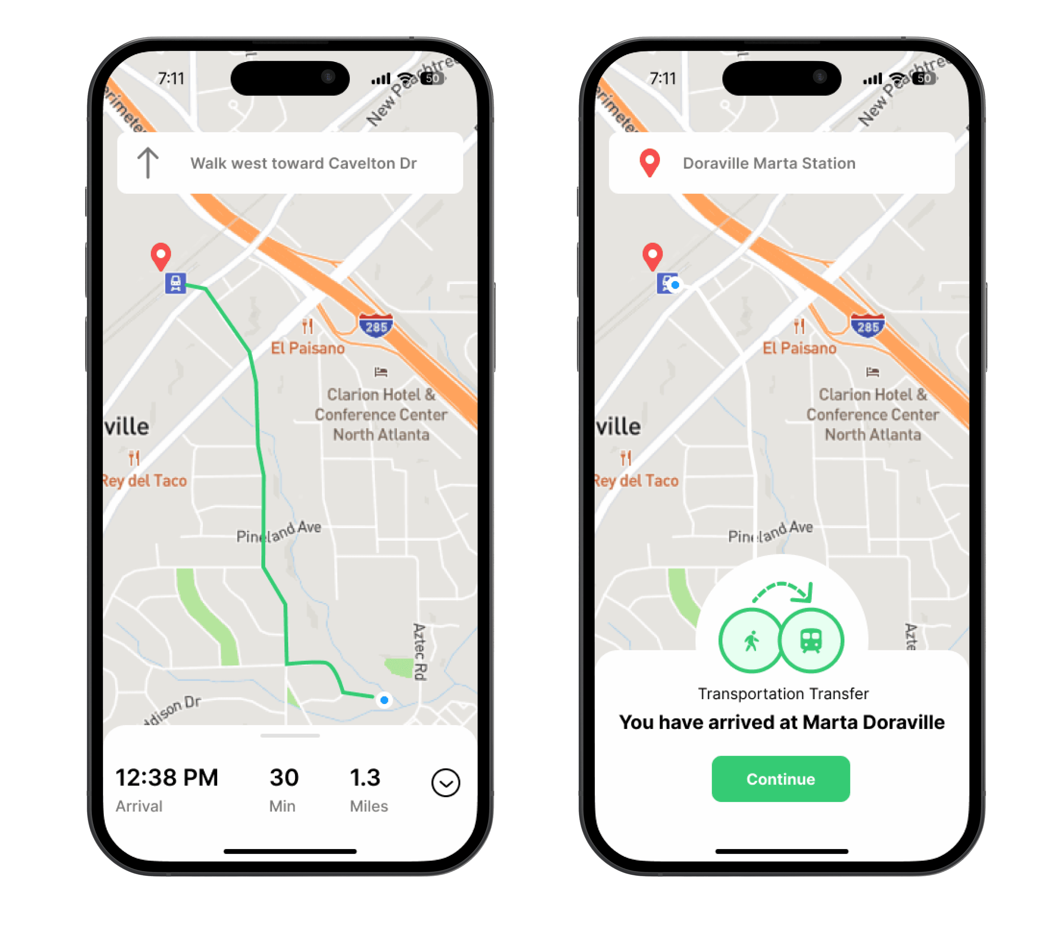
Easy to Follow Navigation
A straight forward guide to help make using multiple forms of transportation simple and efficient.
THE APPROACH
The Goal-Directed Design process provides structure to determine the most important users, their goals and motivation.
01.
RESEARCH
Stakeholder kickoff meeting to establish project objectives. Conduct a literature review, competitive audit, & user interviews.
02.
MODELING
Completing behavior variable maps based on our interviews to synthesize characteristics & goals for our persona.
03.
REQUIREMENTS
Establishing a list of features that are required for our persona to complete their goals.
04.
FRAMEWORKS
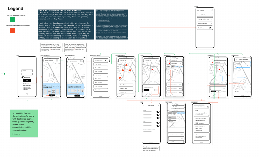
Creating a low-fidelity wireframe and marking our key path scenarios. Begin work on building the final product.
05.
REFINMENT
Conducting usability tests on our product and implementing improvements before the final launch.
KICKOFF MEETING
Getting to know our stakeholder & defining project objectives.
Frank is a software engineer that recently graduated from Kennesaw States Masters program and was in search of UI Designers to help him design a user friendly interface for his navigation software. In the meeting we established the following:
Target User: Individuals who live in urban areas with transit systems, digitally adept, and willing to use multi-mode transportation.
Business Need: The team to convert interface from desktop to mobile.
Revenue: Ticket sales, advertising, and selling services to other companies
MARKET RESEARCH
01. Literature Review
The team conducted a literature review to gather insights on the current state of transportation, where we uncovered the issues in America's current transportation system. An author that really stood out to us was Todd Litman, who is deeply passionate about the subject of multi-modal transportation. View our completed findings below:
View Literature Review
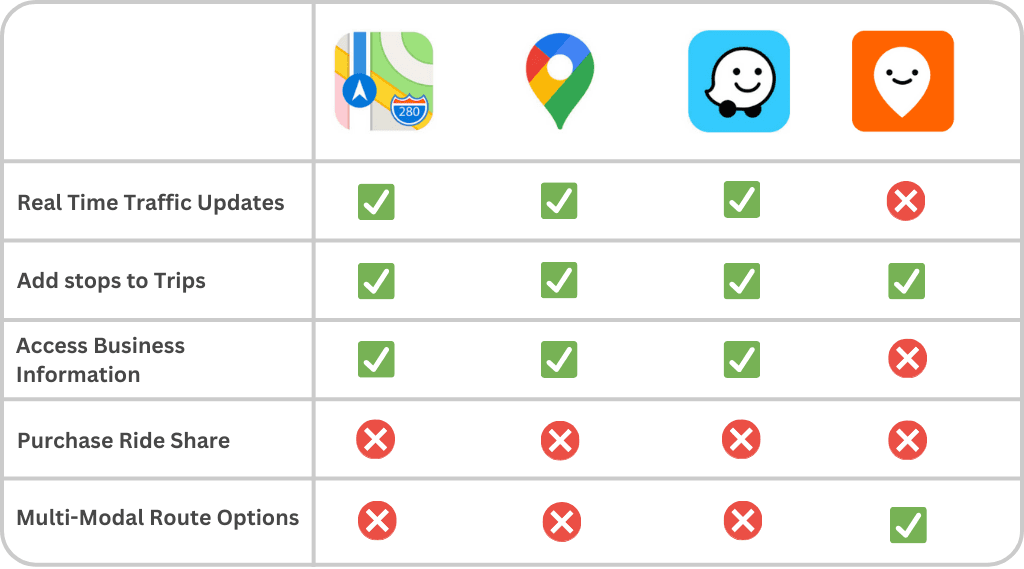
02. Competitive Audit
Popular navigation apps follow the same convention of features.
Existing multi-modal transportation app, Moovit, lacks key features conventions found in the popular navigation apps.
INTERVIEWS
Understanding our Users
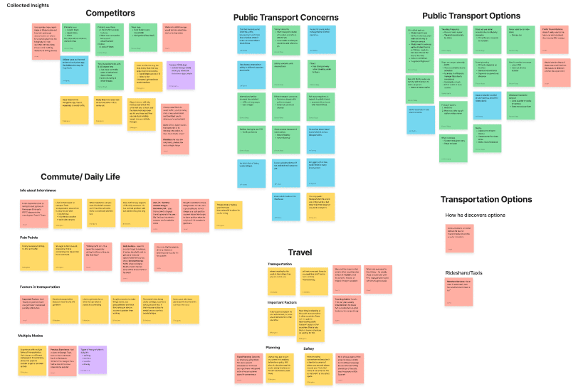
The team conducted a total of 5 virtual interviews to collect data on individuals we deemed as potential users. We organized our notes using affinity maps and these are the following patterns we observed:
Important Factors: Time, Cost, & safety
Pain Point: Traffic Delays & Parking
Daily Commute: Personal Car & Electric Scooter
Navigation App: Google or Apple Maps
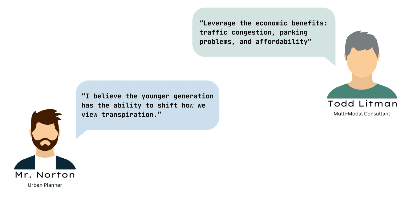
Talking to the Experts
The team had the opportunity to talk to two subject matter experts. They provided us with valuable insights into the world of transportation. If Todd Litman sounds familiar, it's because we discovered him in our literature review and scheduled were able to schedule a meeting!
PERSONA DEVELOPMENT
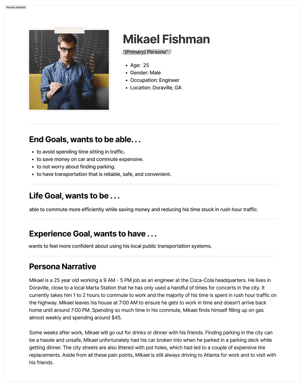
Introducing our primary persona, Mikael Fishman.
Our team compiled the data from our interviews to identify patterns like activities, attitudes, aptitudes, motivations, and skills. After a behavioral variable map exercise we synthesized characteristics and goals to create our persona.
PRODUCTION
Story Telling Through Prototyping.
I aimed for the flow of our app to unfold like a narrative, aligning closely with the details presented in our persona's story. Designing an app centered around a real-time visual and auditory experience posed a slight challenge. To help bring our prototype to life, I used animations and effects like after-delay to help emulate the experience of using a navigation app and being prompted with directions.
REFINMENT
The team conducted 4 usability tests to test the overall flow and usability of our app. Here are some of the problems we encountered & the solutions I came up with to fix them.
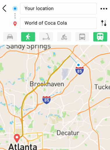
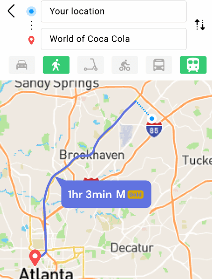
01. Displaying the Local Rail Line
Problem: The color of the GOLD rail line our user takes closely matched the map, which was noted as an issue during our tests.
My Solution: I proposed we change the line to be one of our brand colors and instead displayed the rail line in a pop-up that appears next to the route with the time.
BEFORE
AFTER
02. Adding More Clarity
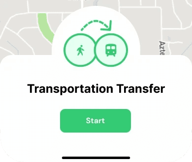
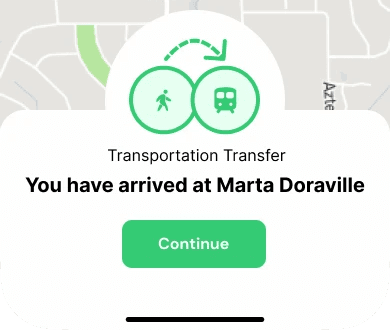
Problem: A user found the "transportation transfer" screen needed more information to better guide them on their route.
My Solution: I made adjustments to the screen layout to provide more information. However, I believe the most impactful change to enhance user comprehension would be replacing the button label from "Start" to "Continue." This adjustment better reflects the user's ongoing journey towards their final destination, rather than initiating a new route.
BEFORE
AFTER
PRESENTATION
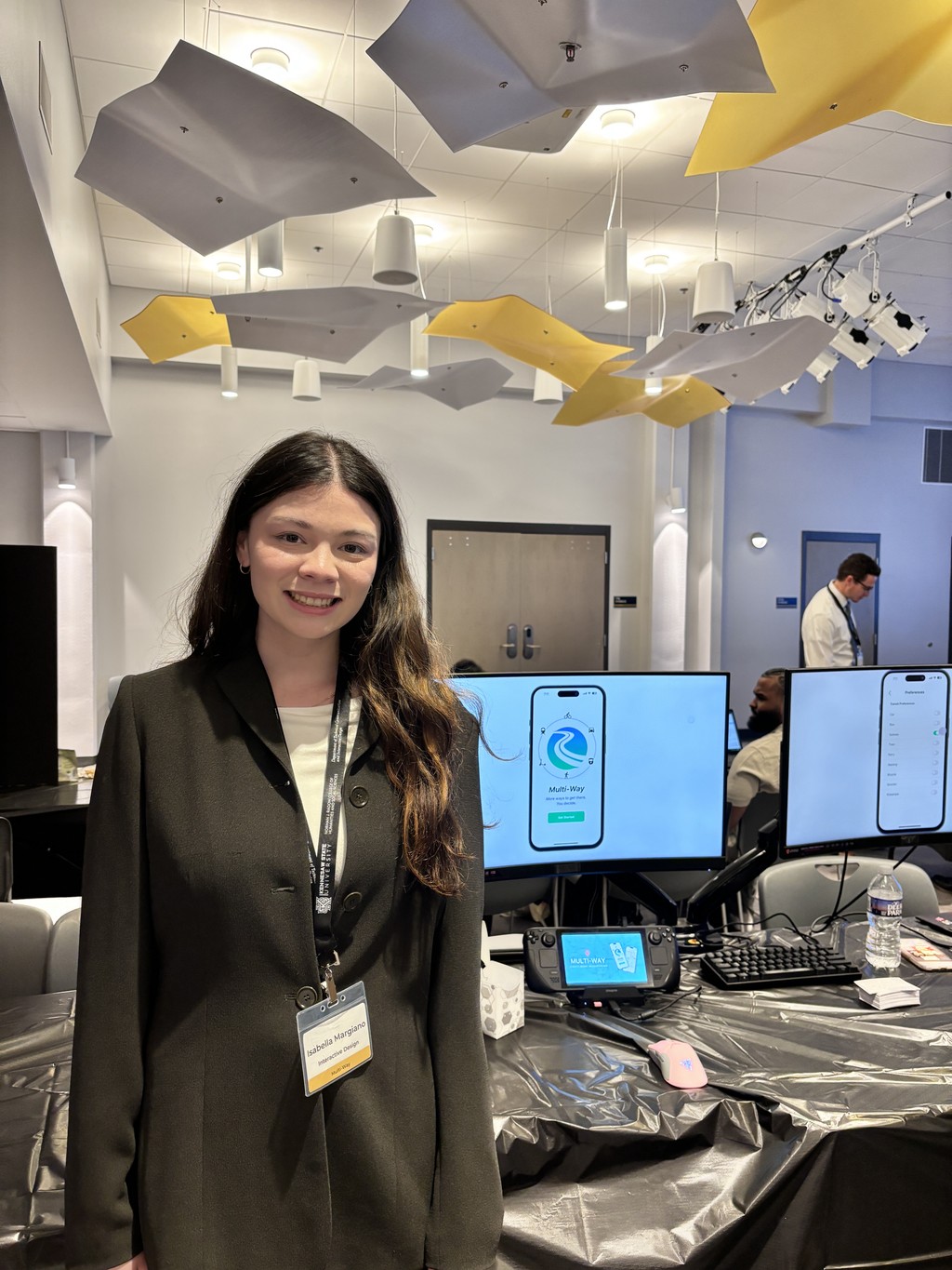
This capstone project ended with a final showcase where we had the chance to present our work to recruiters and industry professionals. One of the highlights was undoubtedly meeting Frank, our stakeholder, in person. The team presented our final prototype directly to him, bridging the gap between theory and practice. I enjoyed the valuable experience of connecting with a stakeholder, explain our designs, and justifying decisions based on the research and data.
